Improving the job process — A LinkedIn Case Study
Redesign of the LinkedIn Jobs Page


Design Interactive Fall ’20 Cohort Project.
Background
With over 660 million users, LinkedIn is an online platform for connecting with professionals, such as potential recruiters or past employers. However, finding a job on this platform can be challenging as people are scrambling to find job opportunities for work experiences.
In the span of six weeks, our team focused on redesigning the job application process within LinkedIn.
Awarded: Most Customer-Centric Experience
Meet the Team: The LinkedIneers

Problem Statement
Unemployed students on LinkedIn have trouble navigating the site due to a lack of feedback and transparency when applying for jobs.
Similar to how our applicants will one day enter the workplace with excitement and determination, we were driven to put our diverse experiences and expertise in action over the course of six weeks. We set out to meet the needs of these students through a human-centered process.
We reimagined the application process during a remote, six-week design sprint.
User Research
We wanted to uncover who utilizes LinkedIn, how they are using it, and how satisfied they are with the platform. Our targeted users were upperclassmen college students and recent college graduates, seeking employment opportunities.
We created surveys to better understand how our users use LinkedIn’s features to apply for a position. We asked users about their age, employment status, satisfaction with the platform, and their purpose for using the site, and features they would like to change. Since we were given a blank slate, we wanted to narrow down our users’ purpose and focus on helping them to achieve their goal.
Surveys
Of the 114 responses we received, 90.3% were college third years and above. Most respondents used LinkedIn to apply for jobs but 53.5% were not satisfied with the site. The highest number of respondents use LinkedIn for finding jobs, followed by networking, listing job experience, and researching companies. We decided to focus on improving job transparency of the application process.

Data collected from our survey conducted through Google Forms
Interviews
We conducted a total of 8 user interviews. During the interviews, we asked users to elaborate on their survey answers and their general experience with LinkedIn features.
We structured our interviews into three main parts:
-
Survey follow-up to better gauge and understand reasoning behind satisfaction levels
-
Questions about overall experience, such as first impressions, primary functions of the site, and frequented features
-
Observational user testing, which allowed us to observe behaviors and listen to thought processes as users completed tasks
From the interviews, we gathered that there was a lack of resources within LinkedIn itself to be sufficient on its own for job-tracking.
The Blackhole
From our research, we discovered that most users are content with LinkedIn but frustrated and overwhelmed by the information they are left to track on their own. After closer analysis of our data through affinity mapping, we narrowed down our three pain points.
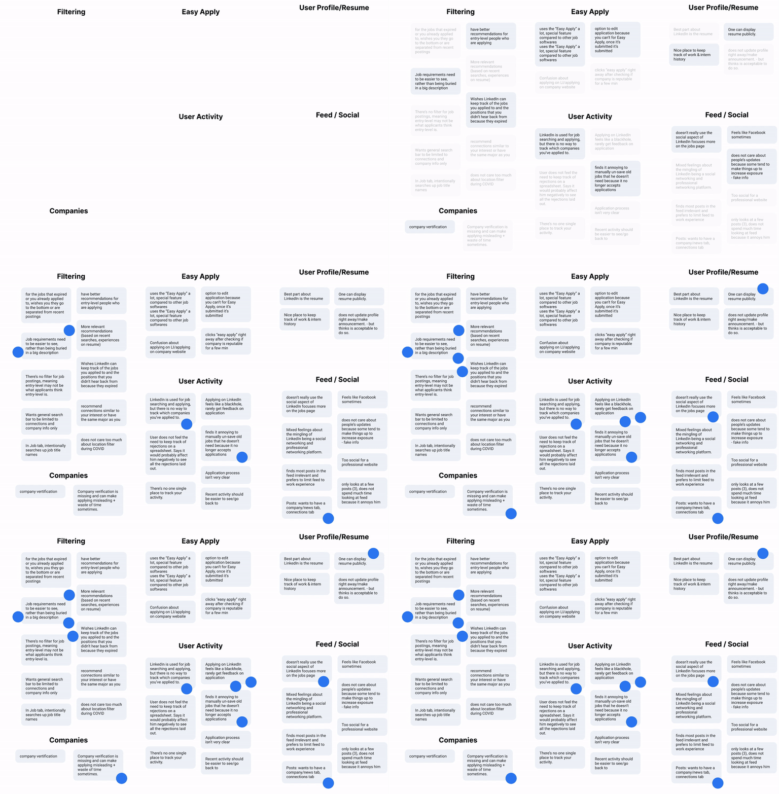
We organized insights and identified key problems through virtual affinity mapping
Pain Points
-
Users rarely receive feedback on applications.
“I wish there was a feature that would help me keep track of all the jobs I applied to and my status of the application during the whole process.”
-
Lack of transparency between employers and applicants.
“Lots of recruiters post jobs that are kind of misleading and have too many requirements to be considered entry-level.”
“filter out fraudulent or scam companies”
-
Information is often overwhelming and unclear.
“I wish I could see requirements for jobs without having to read into every single description.”
“Applying on LinkedIn feels like a black hole.”
Before diving into revamping LinkedIn’s features, we researched how its features aided its users in the application process. Through competitive analysis, we compared features LinkedIn had in common with other popular job search platforms and drew inspiration from the features that LinkedIn lacked from other job search platforms such as Handshake and Monster. We began to dissect the features of LinkedIn that contribute to its utility and dominance as the “professional social networking site”, but more importantly, the features that cause its users frustration and stress.
Ideation & Synthesis
Down to Business
During our ideation phase, we recognized the need to categorize the job page’s essential information to optimize the job search process. Another major consideration was creating a feature that tracked the applicant’s progress from beginning to end.
First, we brainstormed ideas and created a user flow.

Then, we visualized our ideas through rough sketches of wireframes and features that addressed our pain points.
First Impressions Matter
Prior to developing our first prototypes, each of us brainstormed concepts and possible solutions that could better help the user through the application process. Below are our sketches, where we brainstormed two job application trackers and a better interface for the LinkedIn Jobs Dashboard. Our two job application trackers consisted of a list view and a Trello board. We also aimed for a better hierarchy of information in job descriptions.

The Application
We identified five features to add and redesign to improve the job page interface.
-
Search Box → Create a less cluttered landing page.
-
Modularized Job Cards → Reimagine search results list layout as cards to cut down on the page’s cognitive load.
-
Verification Badge → Verified companies are granted a badge to give users confidence about the job listings they are applying for.
-
Tags → Accentuated tags are attached to each card to convey the important details about a job (e.g. salary, seniority level)
-
Application Tracker → Helps the user to organize and track their applications, improving communication between applicant and employer.
Almost there — Mid Fidelity
In our mid-fidelity screens we wanted to reimagine the layout in LinkedIn Jobs search as cards. We thought the grouped information cut down on the cognitive load. To test our ideas, we conducted usability tests to learn more about our newly implemented features.

Usability testing findings:
-
Harsh colors : Users thought the colored tags were harsh and reminded them of stop lights. We went through multiple rounds before choosing a monochromatic color palette so the information was still there but not in a hindering matter.

Timeline of our iterations
-
Remove the Trello board : Almost none of our interviewees found this layout useful, let alone how to interact with it. We decided to take out this feature and focus on our other new feature, the Application Tracker.
-
More information: Users wanted more information on the Job Application Progress page because they were confused about what each step meant. For example, what type of actions are needed for the “action needed” step?
Design System
We found LinkedIn Brand Guidelines online and made our design system based on that information. Our grid system is an 8 point grid (y = x + 8) and we had to use an alternative font because LinkedIn’s font was licensed. Colors were also chosen from their “Extended Palette for Screen”.

Our revised design system
Employing a Solution
1. Landing Page
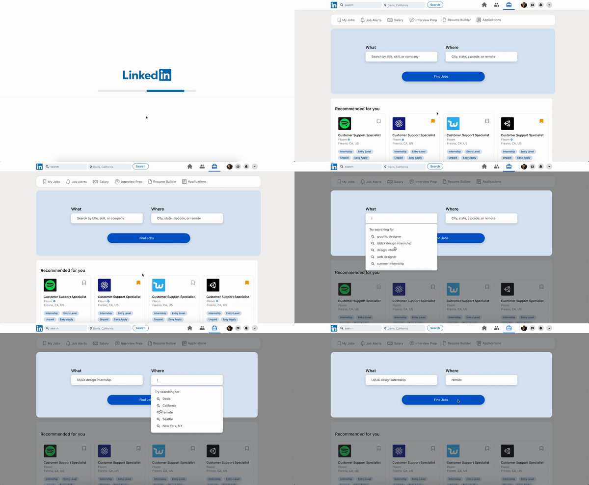
On the landing page we elected to remove elements that did not directly pertain to the user’s job search. Our research uncovered that a large group of users felt the LinkedIn interface is overly cluttered, and a significant portion of our users said they used the platform primarily for job searching. In our design we wanted to reflect our user’s primary needs on LinkedIn, and as such we left only the search bar and job recommendations, where users can see jobs that fit their profile. When the user selects the search bar, the interface singles out this feature to further guide the user’s focus towards their task while minimizing distractions.
2. Job Results
To help the user process the large quantities of information displayed on the search results page, we modularized job listings into cards, and added tags to convey the most important details of a job first.

Toggle filters on the left to filter results
The more in-depth job descriptions have been moved into an overlay and organized in a Cornell Note style in order to provide the user with an interface that is not overly complex at any given time.
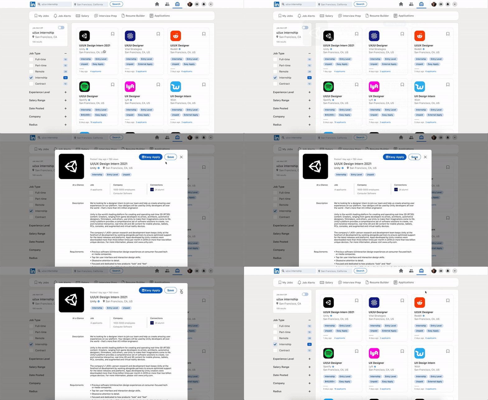
Open the job description as a lightbox overlay
3. Saved Page
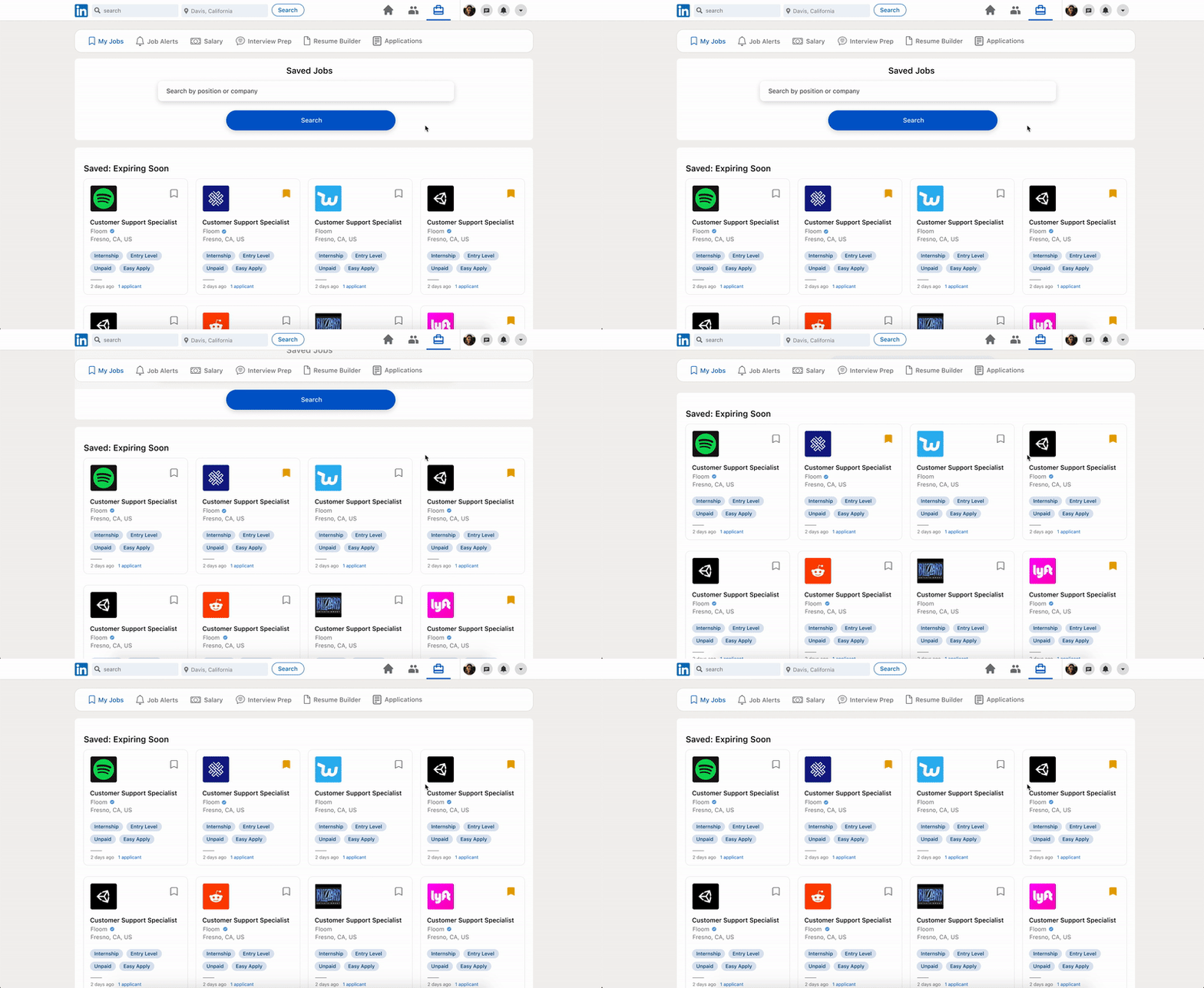
The My Jobs page displays jobs the user has saved in their job search. The content of this page remains mostly unaltered, while we visually redesigned it with our goal in mind to simplify the interface as much as possible. To keep the user experience consistent across the platform, the jobs are presented in the same modularized card layout as before. However to distinguish this page from the landing page, we deemphasized the search field with a white background.
4. Application Page
The Job Application tracker is the new feature we developed for the LinkedIn interface. With this, the user can track the status of their job applications. A progress bar indicates which phase the user’s application is currently in: sent, confirmation, action needed, interview, and offer. Hovering over a phase on the progress bar gives context about that phase. For example, hovering over “Action Needed” displays a list of items the user needs to complete for that application.
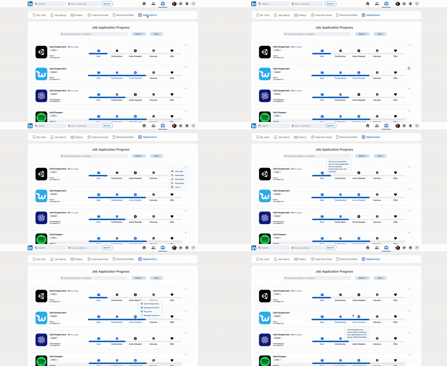
The hover action displays additional information about each phase
The applications on this page can be sorted by the phase they are in, or by if the application was submitted with LinkedIn’s Easy Apply feature. Keeping in mind that not all recruiters may update the status of their received applications, the user can also manually update the phase of each application themselves.
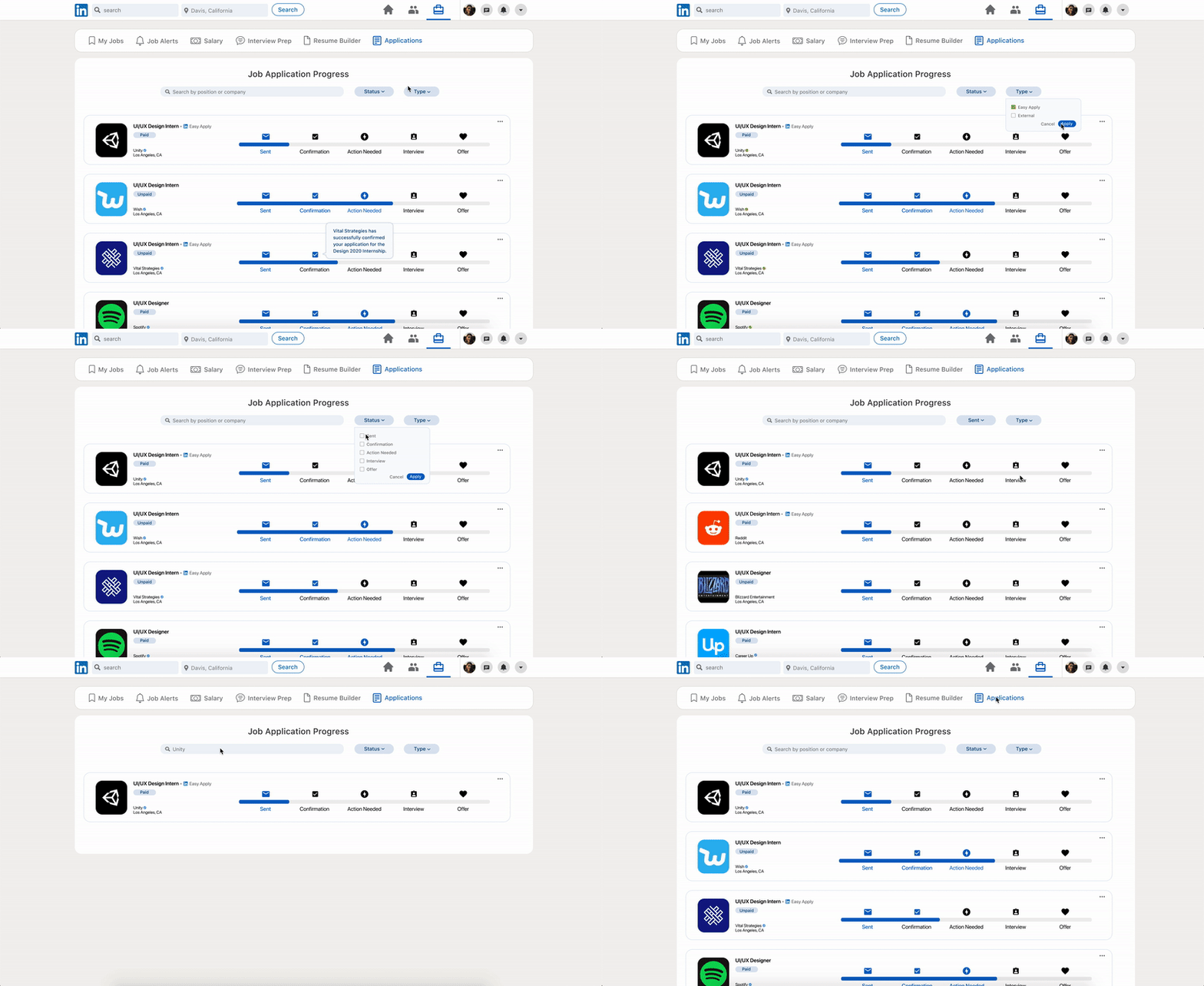
Toggle feature sorts applications by status and/or type
Takeaways:
-
Working collaboratively while remote
-
Prototyping on Figma and becoming more familiar with the UI/UX design process
-
Gaining insight on the job application process and how to empathize with LinkedIn users
-
If we were to do this differently, we would have chosen to focus solely on the Application Tracker given our tight deadline
Future Steps:
-
Contact job recruiters to better understand the job process from their point of view
-
Further develop and research the Application Tracker
-
Iterate on the different pages and continue user testing
-
Create a mobile application