top of page
SPRING 2021
UC Davis Design
Zine


Zuo is based in Beijing and a graduate of the Beijing Institute of Graphic Communication in 2004. Little is known about him and his story, however he reveals himself through his work.
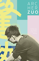
In this design, I chose to have one of Zuo's characters peaking out from the front cover to show how his hidden character is revealed through his work. Lastly, I included his signature seal engraved with his name.


Compositions of the front cover and back cover flow into each other.
Every element of Zuo's work has clear purpose and inspiration throughout each step of the process, from beginning to end.
Recently during quarantine, I learned that my grandfather grew up during the Second Sino-Japanese war on Gulangyu island in Xiamen, a small province located in the Southeastern coast of China in Fujian. He went to college, started a trading business in Hong Kong, and immigrated to the United States in 1984.
Born and raised in Bay Area suburbs as a first generation Chinese American, I lost myself and distanced myself from my own heritage. I buried my culture and denied it when it was exposed. It was almost instinct to turn my back on the places that defined me. I chased after this idea of creating a place for myself and paid no attention to the places that were deeply rooted in my family’s history.
Ironically, Zuo's work revolves around his roots and the beauty of the language he grew up with. I was struck by how Zuo beautifully analyzes the works of historic Chinese painters and philosophers. He does not overwrite the work of those that came before him, but rather offers his own iteration with respect and grace.
Typography Poster


This iteration showcases the two moods of the font using vibrant colors alongside jarring black and white contrast. After creating this concept, I realized that it did not portray that contrast. It reminded me more of the scandalous magazines one might find while waiting in the checkout line at a supermarket.

Fun fact about this final iteration, I created it an hour before the deadline! I was frustrated that my original design did not create the mood I had in mind.
I studied newspaper headlines and how the typeface was used. I kept the tilt of the colors and layout of the second iteration to preserve the design's movement, however I decided to focus on negative space and how it created feelings of emptiness and unease that the vibrant blocks of color filled with action and light.

Final Poster

bottom of page


