Soapbox
Our team took home awards for...
Most Customer-Centric Experience, Most Innovative UX,
and runner up for the Audience Choice Award
Here's to taking a step closer to raising awareness for the fight against hate crimes!

How might we encourage people to take action against hate crimes? As a Design Associate in Design Interactive's Spring 2021 Cohort, I was challenged to create a more effective way for people to support the fight against hate crimes.
Project Overview
Create a more effective way for people to support the fight against hate crimes.
virtual 6-week design sprint with a team of 4 associates overseen by a project manager
Roles: UX research, user testing, prototyping
Tools: Figma, Notion, Google Forms
Approach
We tackled the project in three phases.
Research - Literature Review, Surveys, User Interviews, Competitive Analysis
Synthesis & Ideation - Affinity Mapping, Persona Development, User Flows, Rapid Sketching
Prototyping - Wireframes, Collaborative Iteration, User Testing, Low-High Fidelity Screens
As racial tensions and hate crimes are on the rise and are brought to light, we wanted to help motivate people to take individual action to contribute to the larger cause of fostering inclusive communities.
More people are using online platforms to learn about hate crimes, but young adults in America have trouble staying informed on hate crimes due to scattered resources and lack of conversations about issues of inequality, justice, and discrimination. Our team wanted to tackle these barriers and figure out, how might we encourage people to take action against hate crimes?
Problem Statement
Research
During the research phase, we conducted literature reviews, surveys, and interviews to understand and gain more insight about hate crime and our users.
Literature Review
Before diving into surveys and interviews, we sought to understand hate crimes and why it is an issue that should be addressed. According to the Department of Justice, hate crime at the federal level is defined as:
“A crime motivated against race, color, religion, national origin, sexual orientation, gender, gender identity, or disability.”
Hate crimes have been increasing almost every year in the US since 2014. Although hate crimes decreased by 7% in 2020, it is suspected that it is due to the pandemic and the lack of public interaction. On the other hand, there has been a 150% increase in hate crime against Asian-Americans, 7% rise in religion-based hate crime, and 14% increase in crimes targeting Jewish institutions.
The surge in violent cases of hate crime towards minorities has terrorized and adversely affected the communities involved. It is important that we inform ourselves about the effects of hate crime, so we can show support and help the victims, send messages about the communities’ intolerance to hate crime, and assist law enforcement to understand the gravity of the situation and the resources needed to keep people safe.
Surveys
In our updated survey, we asked new open and closed ended questions to identify how people engage, why they engage, and where they engage with the topic of hate crimes. 51.4% of respondents believe that there is not an efficient system to inform people of hate crime. Additionally, many mentioned that the best way to combat hate crime is to stay informed, educated on the topic, and spread awareness about the topic.

Interviews
We conducted a total of 7 interviews. We also asked users to guide us through their process of learning about hate crime and what their next steps were.
What we learned:
-
lack of cohesion about hate crime information between platforms
-
absence of dialogue between users when addressing the larger issues behind hate crimes
Pain Points
After gathering survey responses and conducting user interviews, we were surprised to learn how scattered pathways to taking action against hate crimes were. Users used a variety of platforms, mediums, and sources to decide how they would end up taking action, whether that be through donating, organizing, educating, etc.
Concern about Legitimacy
-
Broadcasts can distort news and be biased
-
Posts cannot give users the full story (surface level)
-
Potential to exploit information
Lack of Dialogue
-
People can just repost and post but there is little conversation about the actual social issue
-
Another “do it and go next” task
Performative Activism
-
Surface level activism
-
“If you don’t post, it didn’t happen”
-
Lack of genuine understanding
Competitive Analysis
Before diving into designing our application, we researched what features in existing applications allowed users to stay informed and increase dialogue. Through studying other platforms like GoFundMe and Reddit, we drew inspiration from features that could possibly counter the pain points mentioned.
User Persona
With the information we gathered from our user research, I then created two user personas. Our accumulation of different insights and common patterns helped me to create two user personas, a manifestation of the data in a character. Here, we can see our users’ preferences on how to solve problems, goals, motivations, frustrations, and needs.
Our user personas Natalie and Daniel are undergraduate students at UC Davis who want to understand the nature and history of hate crimes so they can support victims both in and out of the community.

Synthesis & Ideation
Initial Direction
The initial direction of our project focused on the idea that not all anti-hate crime fundraisers receive adequate funding. It is also difficult for people to find the correct resources to donate to, confirm the legitimacy of these fundraisers, and determine whether their financial support is making a difference. However, we found through our research that the financial aspect was already well-done by other platforms. Our research also revealed that people actually wanted to educate and inform themselves.
Changing Directions
After our first round of research we realized the prompt we were designing around did not align with our users’ needs. Solely relying on monetary support as a solution to hate crimes is the direct manifestation of the same type of “performative activism” that both we and our users were concerned about, leading us to take a new direction with our research.
After we developed a new problem statement that allowed us to explore more solutions, we set off on a second round of user research complete with additional interviews and surveys.
How might we create a more effective way for people to financially support the fight against hate crimes?
Problem Statement
How might we encourage people to take action against hate crimes?
Affinity Mapping

During our synthesis and ideation phase, we synthesized our research findings using affinity mapping. After making connections within our data and identifying common behaviors, we narrowed down three main insights that we used to drive the direction of our app:
-
Dialogue is often the most productive from of education.
-
Donations are sometimes given without understanding the reason behind it.
-
Social media enables performative activism, which is ineffective for real change.
Rapid Sketching
After we set off in a new direction, we also had a second round of sketching geared toward our new HMW statement. Below are my sketches for both phases:

Round 1 Sketches
Instagram Extension
INSPIRED BY INITIAL HMW
5 minutes prior our team meeting, I quickly scribbled this idea down. Since most users come across news and activism posts through Instagram, I wanted to create a place on the app where people could find a collection of posts, resources, and organizations so that users would not come across resources by chance, but rather by intentional action. Their exposure would not be limited by their friend circle's activity.

Round 2 Sketches
Learn, Grow, Inform: a journey
INSPIRED BY NEW HMW
After we set off in a new direction, we focused more on the educational aspect of the user's journey in the fight against hate crimes. I sketched a track that would help the user understand people's stories (Learn), develop and their own perspective based on resources (Grow), and turn their values into action by ultimately informing others and donating (Inform).
-
Questionnaire to understand where the user stands on the spectrum and their needs (inspired by the Harry Potter quiz! :))
-
Learn, Grow, Inform 3-stage track
-
Dialogue Buddies: a user from each stage would be matched and invited to have a live discussion
Team Sketches Round 2
INSPIRED BY NEW HMW
Using our insights from affinity mapping, we sketched ideas for possible solutions. Some key ideas included: creating a community where people can exchange perspectives, a location feature that allows users to help locally, and curating resources to provide users with relevant information.

Genius ideas by the Soapbox Crew: Kai, Shirley, Jessica, and I :)
User Flow
After uniting our sketches, we created a user flow to better understand the new architecture of our app. We decided to organize and structure our content into three main sections that focused on helping people take action against hate crimes: learn, discuss, and donate.
-
Learn allows users to educate themselves on different topics.
-
Discuss encourages users to start dialogue with others.
-
Donate lets users contribute to organizations or causes they support.

Prototyping
Lo-fi Prototyping
We then created lo-fi wireframes guided by the user flow. This basic skeletal framework of the app allowed us to focus on functionality over appearance.

We implemented a Learn section that allows users to browse different media to educate themselves about the topics they are interested in.
We also wanted to explore ways to increase dialogue, so we had a Live Chat and a Write page for the Dialogue (Discuss) section. The Live Chat page would help people interact with each other like normal conversations through streaming and Write would allow people to type out their thoughts.
Finally, we applied a Donate section that allowed users to direct their support and browse for different donations that exist.
Usability Testing Round 1
We created a set of realistic tasks to engage users and their goals in each section of the prototype. This first round of testing was crucial in providing good insights for changes within our initial user flow.


We decided to remove the Live section because users expressed a cognitive overload and confusion between the two sections within the Discuss page: Live Chats and Write.
Users also felt that they would be more intentional with their words in written discussions as opposed to live conversations.
Additionally, we found that users needed an onboarding section to introduce each section and its purpose for a smoother user flow.
Lastly, we realized we needed better word choice that would encourage users to take action.
Mid-fi Prototyping
In preparation for our second round of user testing, we focused on unifying our overall visual design in our medium fidelity wireframes.

Design System: We implemented a neutral color palette that we felt allowed users to approach topics with a more receptive, open mind. We wanted to go for something neutral, comfortable, and calm in response to the news and stories on the app that may be a source of strong emotions such as frustration and anger.


We developed a new filtering system. The distance slider replaced the radius filter and the button filters replaced the dropdown filters since users preferred only a few categories.

We also unified the card layout for each section’s feed to create a clear visual hierarchy and improve mobility when changing between sections.
Usability Testing Round 2
In this round of testing, we instructed users to perform the same tasks for each existing section. We focused on understanding our users’ intuitive decision-making, attitudes, and emotional response to the app.

We found that filter word choice (Top, Trending, New, and Understated) and the vague range of the location slider confused and limited users.

Users noticed that the colors felt very calm, plain, and did not match the content that the app displayed.

Lastly, we noticed that consolidating the individual saved pages into one local saved page is more intuitive for the user and would allow them to access their saved items from one place.
Hi-fi Prototyping
Almost there! We refined our prototype based on the results from the second user testing.


The Filtering System
There is no such thing as “too many iterations” :P
We wanted to find a way for users to focus specifically on the needs of their community. After testing various forms of the original radius slider, we decided on a filter that allows users to enter in the city they wish to read topics from, whether it be their own area or another city across the world!
Design System
Lastly, we realized that our original color palette was too muted, lacked character, and did not reflect the message we wanted our platform to represent.
So, we revised our design system and chose colors that better reflected action and urgency. We wanted to make users feel more motivated, inspired and energized to take action; to educate themselves, to have conversations that address issues of justice, and to see the urgent needs in their communities.


Final Solution
Soapbox
After putting everything together, our final solution is Soapbox: a mobile application that motivates individuals to take action against hate crimes through learning from a collection of resources, creating meaningful discussions about urgent issues, and contributing to different causes with educated donations.
Learn Section
SHIRLEY


Customized Feed
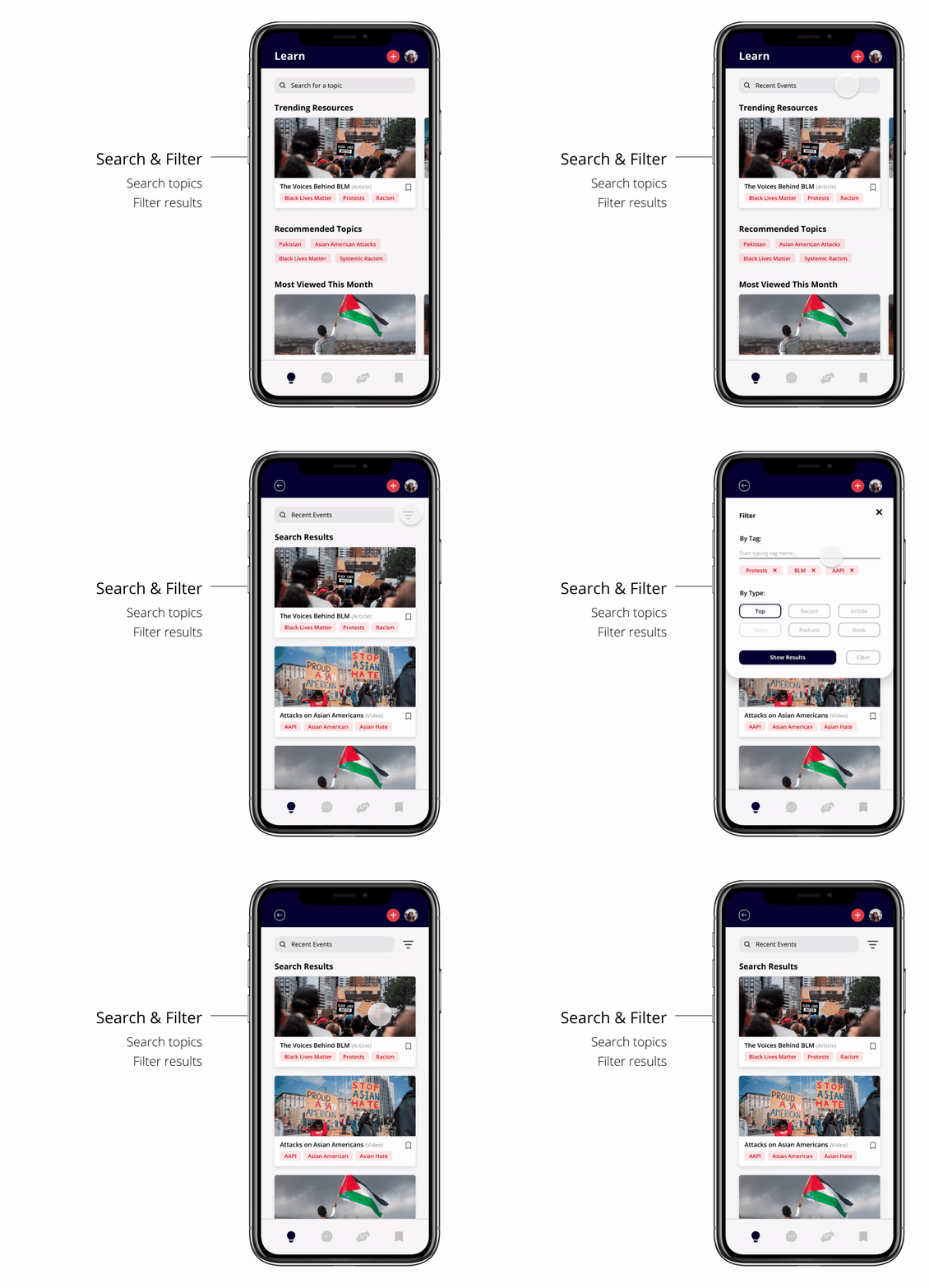
Our learn section provides users with a collection of resources about different issues that they can use to educate themselves. The landing page provides a customized feed of highlighted resources, as well as recommended topic tags for the user to explore.
Search & Filter
We included a search bar to allow the user to find resources about any issues they are interested in and after searching, users can filter through what they’d like to see by tag or by media type.
Resource Collection
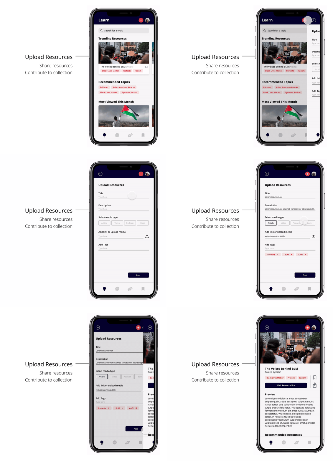
The resource collection includes a variety of media types, as we found through our research that some people prefer articles, while others prefer videos or podcasts. Users get a preview of the resource and a button brings them off site to access the resource in full. Each resource page also provides recommendations to encourage users to continue their learning.
Upload Resources
Since our app is meant to be a collection of resources put together by the community of users, they can easily upload and share educational material here.
Discuss Section
RACHEL & JESSICA
In the Discuss section, thoughtful dialogue can acknowledge different perspectives while inviting empathy. And questions that lead to conversation allows the community to solve a problem together and perhaps begin to validate that people’s stories and concerns are heard and understood.
Join a discussion
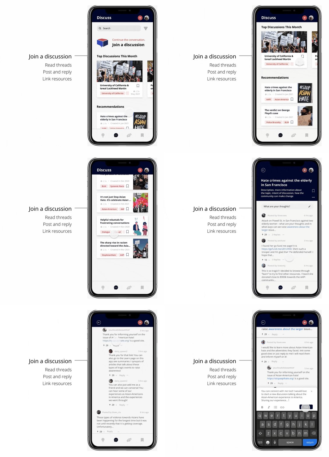
Once users have filtered and searched to their heart’s content for a discussion, users are briefed by a preview where they can read about the purpose and context of the discussion before joining.
Users can then scroll through threads, post and reply, and even link resources to support their thoughts.
Create a discussion
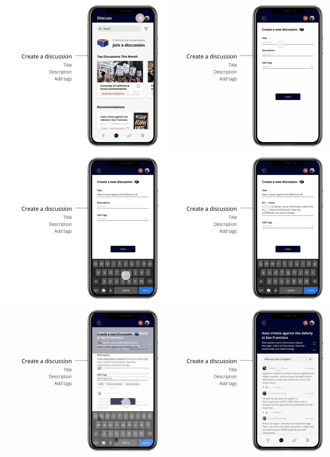
Users can also create their own discussion and be the one to start the conversation. Users can enter a discussion title, give a description or context, and add tags to help categorize content using keywords.
Filter the content
Users can also filter and sort their information in combination with different tags or even choose specific locations, which allows them to engage with their community or different communities across the world. For example, if someone from New York wanted to see discussions about San Francisco, they can change their preferences in the filter.
Donate Section
KAI


Customized Feed
On the donation page, users can browse different organizations and filter them to their liking.
Organization Profiles
Selecting an organization’s card opens up a profile that includes a mission statement, link to donate externally, and similar recommended organizations.
Saved Section
EVERYONE

All from one place
The saved page brings together all the bookmarked contents in one convenient page that encourages long-term engagement.
How might we encourage people to take action against hate crimes? As a Design Associate in Design Interactive's Spring 2021 Cohort, I was challenged to create a more effective way for people to support the fight against hate crimes.
Project Overview
Create a more effective way for people to support the fight against hate crimes.
virtual 6-week design sprint with a team of 4 associates overseen by a project manager
Roles: UX research, user testing, prototyping
Tools: Figma, Notion, Google Forms
Approach
We tackled the project in three phases.
Research - Literature Review, Surveys, User Interviews, Competitive Analysis
Synthesis & Ideation - Affinity Mapping, Persona Development, User Flows, Rapid Sketching
Prototyping - Wireframes, Collaborative Iteration, User Testing, Low-High Fidelity Screens
As racial tensions and hate crimes are on the rise and are brought to light, we wanted to help motivate people to take individual action to contribute to the larger cause of fostering inclusive communities.
More people are using online platforms to learn about hate crimes, but young adults in America have trouble staying informed on hate crimes due to scattered resources and lack of conversations about issues of inequality, justice, and discrimination. Our team wanted to tackle these barriers and figure out, how might we encourage people to take action against hate crimes?
Problem Statement
Research
During the research phase, we conducted literature reviews, surveys, and interviews to understand and gain more insight about hate crime and our users.
Literature Review
Before diving into surveys and interviews, we sought to understand hate crimes and why it is an issue that should be addressed. According to the Department of Justice, hate crime at the federal level is defined as:
“A crime motivated against race, color, religion, national origin, sexual orientation, gender, gender identity, or disability.”
Hate crimes have been increasing almost every year in the US since 2014. Although hate crimes decreased by 7% in 2020, it is suspected that it is due to the pandemic and the lack of public interaction. On the other hand, there has been a 150% increase in hate crime against Asian-Americans, 7% rise in religion-based hate crime, and 14% increase in crimes targeting Jewish institutions.
The surge in violent cases of hate crime towards minorities has terrorized and adversely affected the communities involved. It is important that we inform ourselves about the effects of hate crime, so we can show support and help the victims, send messages about the communities’ intolerance to hate crime, and assist law enforcement to understand the gravity of the situation and the resources needed to keep people safe.
Surveys
In our updated survey, we asked new open and closed ended questions to identify how people engage, why they engage, and where they engage with the topic of hate crimes. 51.4% of respondents believe that there is not an efficient system to inform people of hate crime. Additionally, many mentioned that the best way to combat hate crime is to stay informed, educated on the topic, and spread awareness about the topic.

Interviews
We conducted a total of 7 interviews. We also asked users to guide us through their process of learning about hate crime and what their next steps were.
What we learned:
-
lack of cohesion about hate crime information between platforms
-
absence of dialogue between users when addressing the larger issues behind hate crimes
Pain Points
After gathering survey responses and conducting user interviews, we were surprised to learn how scattered pathways to taking action against hate crimes were. Users used a variety of platforms, mediums, and sources to decide how they would end up taking action, whether that be through donating, organizing, educating, etc.
Concern about Legitimacy
-
Broadcasts can distort news and be biased
-
Posts cannot give users the full story (surface level)
-
Potential to exploit information
Lack of Dialogue
-
People can just repost and post but there is little conversation about the actual social issue
-
Another “do it and go next” task
Performative Activism
-
Surface level activism
-
“If you don’t post, it didn’t happen”
-
Lack of genuine understanding
Competitive Analysis
Before diving into designing our application, we researched what features in existing applications allowed users to stay informed and increase dialogue. Through studying other platforms like GoFundMe and Reddit, we drew inspiration from features that could possibly counter the pain points mentioned.
User Persona
With the information we gathered from our user research, I then created two user personas. Our accumulation of different insights and common patterns helped me to create two user personas, a manifestation of the data in a character. Here, we can see our users’ preferences on how to solve problems, goals, motivations, frustrations, and needs.
Our user personas Natalie and Daniel are undergraduate students at UC Davis who want to understand the nature and history of hate crimes so they can support victims both in and out of the community.

Synthesis & Ideation
Initial Direction
The initial direction of our project focused on the idea that not all anti-hate crime fundraisers receive adequate funding. It is also difficult for people to find the correct resources to donate to, confirm the legitimacy of these fundraisers, and determine whether their financial support is making a difference. However, we found through our research that the financial aspect was already well-done by other platforms. Our research also revealed that people actually wanted to educate and inform themselves.
Changing Directions
After our first round of research we realized the prompt we were designing around did not align with our users’ needs. Solely relying on monetary support as a solution to hate crimes is the direct manifestation of the same type of “performative activism” that both we and our users were concerned about, leading us to take a new direction with our research.
After we developed a new problem statement that allowed us to explore more solutions, we set off on a second round of user research complete with additional interviews and surveys.
How might we create a more effective way for people to financially support the fight against hate crimes?
Problem Statement
How might we encourage people to take action against hate crimes?
Affinity Mapping

During our synthesis and ideation phase, we synthesized our research findings using affinity mapping. After making connections within our data and identifying common behaviors, we narrowed down three main insights that we used to drive the direction of our app:
-
Dialogue is often the most productive from of education.
-
Donations are sometimes given without understanding the reason behind it.
-
Social media enables performative activism, which is ineffective for real change.
Rapid Sketching
After we set off in a new direction, we also had a second round of sketching geared toward our new HMW statement. Below are my sketches for both phases:

Round 1 Sketches
Instagram Extension
INSPIRED BY INITIAL HMW
5 minutes prior our team meeting, I quickly scribbled this idea down. Since most users come across news and activism posts through Instagram, I wanted to create a place on the app where people could find a collection of posts, resources, and organizations so that users would not come across resources by chance, but rather by intentional action. Their exposure would not be limited by their friend circle's activity.

Round 2 Sketches
Learn, Grow, Inform: a journey
INSPIRED BY NEW HMW
After we set off in a new direction, we focused more on the educational aspect of the user's journey in the fight against hate crimes. I sketched a track that would help the user understand people's stories (Learn), develop and their own perspective based on resources (Grow), and turn their values into action by ultimately informing others and donating (Inform).
-
Questionnaire to understand where the user stands on the spectrum and their needs (inspired by the Harry Potter quiz! :))
-
Learn, Grow, Inform 3-stage track
-
Dialogue Buddies: a user from each stage would be matched and invited to have a live discussion
Team Sketches Round 2
INSPIRED BY NEW HMW
Using our insights from affinity mapping, we sketched ideas for possible solutions. Some key ideas included: creating a community where people can exchange perspectives, a location feature that allows users to help locally, and curating resources to provide users with relevant information.

Genius ideas by the Soapbox Crew: Kai, Shirley, Jessica, and I :)
User Flow
After uniting our sketches, we created a user flow to better understand the new architecture of our app. We decided to organize and structure our content into three main sections that focused on helping people take action against hate crimes: learn, discuss, and donate.
-
Learn allows users to educate themselves on different topics.
-
Discuss encourages users to start dialogue with others.
-
Donate lets users contribute to organizations or causes they support.

Prototyping
Lo-fi Prototyping
We then created lo-fi wireframes guided by the user flow. This basic skeletal framework of the app allowed us to focus on functionality over appearance.

We implemented a Learn section that allows users to browse different media to educate themselves about the topics they are interested in.
We also wanted to explore ways to increase dialogue, so we had a Live Chat and a Write page for the Dialogue (Discuss) section. The Live Chat page would help people interact with each other like normal conversations through streaming and Write would allow people to type out their thoughts.
Finally, we applied a Donate section that allowed users to direct their support and browse for different donations that exist.
Usability Testing Round 1
We created a set of realistic tasks to engage users and their goals in each section of the prototype. This first round of testing was crucial in providing good insights for changes within our initial user flow.


We decided to remove the Live section because users expressed a cognitive overload and confusion between the two sections within the Discuss page: Live Chats and Write.
Users also felt that they would be more intentional with their words in written discussions as opposed to live conversations.
Additionally, we found that users needed an onboarding section to introduce each section and its purpose for a smoother user flow.
Lastly, we realized we needed better word choice that would encourage users to take action.
Mid-fi Prototyping
In preparation for our second round of user testing, we focused on unifying our overall visual design in our medium fidelity wireframes.

Design System: We implemented a neutral color palette that we felt allowed users to approach topics with a more receptive, open mind. We wanted to go for something neutral, comfortable, and calm in response to the news and stories on the app that may be a source of strong emotions such as frustration and anger.


We developed a new filtering system. The distance slider replaced the radius filter and the button filters replaced the dropdown filters since users preferred only a few categories.

We also unified the card layout for each section’s feed to create a clear visual hierarchy and improve mobility when changing between sections.
Usability Testing Round 2
In this round of testing, we instructed users to perform the same tasks for each existing section. We focused on understanding our users’ intuitive decision-making, attitudes, and emotional response to the app.

We found that filter word choice (Top, Trending, New, and Understated) and the vague range of the location slider confused and limited users.

Users noticed that the colors felt very calm, plain, and did not match the content that the app displayed.

Lastly, we noticed that consolidating the individual saved pages into one local saved page is more intuitive for the user and would allow them to access their saved items from one place.
Hi-fi Prototyping
Almost there! We refined our prototype based on the results from the second user testing.


The Filtering System
There is no such thing as “too many iterations” :P
We wanted to find a way for users to focus specifically on the needs of their community. After testing various forms of the original radius slider, we decided on a filter that allows users to enter in the city they wish to read topics from, whether it be their own area or another city across the world!
Design System
Lastly, we realized that our original color palette was too muted, lacked character, and did not reflect the message we wanted our platform to represent.
So, we revised our design system and chose colors that better reflected action and urgency. We wanted to make users feel more motivated, inspired and energized to take action; to educate themselves, to have conversations that address issues of justice, and to see the urgent needs in their communities.


Final Solution
Soapbox
After putting everything together, our final solution is Soapbox: a mobile application that motivates individuals to take action against hate crimes through learning from a collection of resources, creating meaningful discussions about urgent issues, and contributing to different causes with educated donations.
Learn Section
SHIRLEY


Customized Feed
Our learn section provides users with a collection of resources about different issues that they can use to educate themselves. The landing page provides a customized feed of highlighted resources, as well as recommended topic tags for the user to explore.
Search & Filter
We included a search bar to allow the user to find resources about any issues they are interested in and after searching, users can filter through what they’d like to see by tag or by media type.
Resource Collection
The resource collection includes a variety of media types, as we found through our research that some people prefer articles, while others prefer videos or podcasts. Users get a preview of the resource and a button brings them off site to access the resource in full. Each resource page also provides recommendations to encourage users to continue their learning.
Upload Resources
Since our app is meant to be a collection of resources put together by the community of users, they can easily upload and share educational material here.
Discuss Section
RACHEL & JESSICA
In the Discuss section, thoughtful dialogue can acknowledge different perspectives while inviting empathy. And questions that lead to conversation allows the community to solve a problem together and perhaps begin to validate that people’s stories and concerns are heard and understood.

Join a discussion
Once users have filtered and searched to their heart’s content for a discussion, users are briefed by a preview where they can read about the purpose and context of the discussion before joining.
Users can then scroll through threads, post and reply, and even link resources to support their thoughts.

Create a discussion
Users can also create their own discussion and be the one to start the conversation. Users can enter a discussion title, give a description or context, and add tags to help categorize content using keywords.

Filter the content
Users can also filter and sort their information in combination with different tags or even choose specific locations, which allows them to engage with their community or different communities across the world. For example, if someone from New York wanted to see discussions about San Francisco, they can change their preferences in the filter.
Donate Section
KAI


Customized Feed
On the donation page, users can browse different organizations and filter them to their liking.
Organization Profiles
Selecting an organization’s card opens up a profile that includes a mission statement, link to donate externally, and similar recommended organizations.
Saved Section
EVERYONE

All from one place
The saved page brings together all the bookmarked contents in one convenient page that encourages long-term engagement.
How might we encourage people to take action against hate crimes? As a Design Associate in Design Interactive's Spring 2021 Cohort, I was challenged to create a more effective way for people to support the fight against hate crimes.
Project Overview
Create a more effective way for people to support the fight against hate crimes.
virtual 6-week design sprint with a team of 4 associates overseen by a project manager
Roles: UX research, user testing, prototyping
Tools: Figma, Notion, Google Forms
Approach
We tackled the project in three phases.
Research - Literature Review, Surveys, User Interviews, Competitive Analysis
Synthesis & Ideation - Affinity Mapping, Persona Development, User Flows, Rapid Sketching
Prototyping - Wireframes, Collaborative Iteration, User Testing, Low-High Fidelity Screens
As racial tensions and hate crimes are on the rise and are brought to light, we wanted to help motivate people to take individual action to contribute to the larger cause of fostering inclusive communities.
More people are using online platforms to learn about hate crimes, but young adults in America have trouble staying informed on hate crimes due to scattered resources and lack of conversations about issues of inequality, justice, and discrimination. Our team wanted to tackle these barriers and figure out, how might we encourage people to take action against hate crimes?
Problem Statement
Research
During the research phase, we conducted literature reviews, surveys, and interviews to understand and gain more insight about hate crime and our users.
Literature Review
Before diving into surveys and interviews, we sought to understand hate crimes and why it is an issue that should be addressed. According to the Department of Justice, hate crime at the federal level is defined as:
“A crime motivated against race, color, religion, national origin, sexual orientation, gender, gender identity, or disability.”
Hate crimes have been increasing almost every year in the US since 2014. Although hate crimes decreased by 7% in 2020, it is suspected that it is due to the pandemic and the lack of public interaction. On the other hand, there has been a 150% increase in hate crime against Asian-Americans, 7% rise in religion-based hate crime, and 14% increase in crimes targeting Jewish institutions.
The surge in violent cases of hate crime towards minorities has terrorized and adversely affected the communities involved. It is important that we inform ourselves about the effects of hate crime, so we can show support and help the victims, send messages about the communities’ intolerance to hate crime, and assist law enforcement to understand the gravity of the situation and the resources needed to keep people safe.
Surveys
In our updated survey, we asked new open and closed ended questions to identify how people engage, why they engage, and where they engage with the topic of hate crimes. 51.4% of respondents believe that there is not an efficient system to inform people of hate crime. Additionally, many mentioned that the best way to combat hate crime is to stay informed, educated on the topic, and spread awareness about the topic.

Interviews
We conducted a total of 7 interviews. We also asked users to guide us through their process of learning about hate crime and what their next steps were.
What we learned:
-
lack of cohesion about hate crime information between platforms
-
absence of dialogue between users when addressing the larger issues behind hate crimes
Pain Points
After gathering survey responses and conducting user interviews, we were surprised to learn how scattered pathways to taking action against hate crimes were. Users used a variety of platforms, mediums, and sources to decide how they would end up taking action, whether that be through donating, organizing, educating, etc.
Concern about Legitimacy
-
Broadcasts can distort news and be biased
-
Posts cannot give users the full story (surface level)
-
Potential to exploit information
Lack of Dialogue
-
People can just repost and post but there is little conversation about the actual social issue
-
Another “do it and go next” task
Performative Activism
-
Surface level activism
-
“If you don’t post, it didn’t happen”
-
Lack of genuine understanding
Competitive Analysis
Before diving into designing our application, we researched what features in existing applications allowed users to stay informed and increase dialogue. Through studying other platforms like GoFundMe and Reddit, we drew inspiration from features that could possibly counter the pain points mentioned.
User Persona
With the information we gathered from our user research, I then created two user personas. Our accumulation of different insights and common patterns helped me to create two user personas, a manifestation of the data in a character. Here, we can see our users’ preferences on how to solve problems, goals, motivations, frustrations, and needs.
Our user personas Natalie and Daniel are undergraduate students at UC Davis who want to understand the nature and history of hate crimes so they can support victims both in and out of the community.

Synthesis & Ideation
Initial Direction
The initial direction of our project focused on the idea that not all anti-hate crime fundraisers receive adequate funding. It is also difficult for people to find the correct resources to donate to, confirm the legitimacy of these fundraisers, and determine whether their financial support is making a difference. However, we found through our research that the financial aspect was already well-done by other platforms. Our research also revealed that people actually wanted to educate and inform themselves.
Changing Directions
After our first round of research we realized the prompt we were designing around did not align with our users’ needs. Solely relying on monetary support as a solution to hate crimes is the direct manifestation of the same type of “performative activism” that both we and our users were concerned about, leading us to take a new direction with our research.
After we developed a new problem statement that allowed us to explore more solutions, we set off on a second round of user research complete with additional interviews and surveys.
How might we create a more effective way for people to financially support the fight against hate crimes?
Problem Statement
How might we encourage people to take action against hate crimes?
Affinity Mapping

During our synthesis and ideation phase, we synthesized our research findings using affinity mapping. After making connections within our data and identifying common behaviors, we narrowed down three main insights that we used to drive the direction of our app:
-
Dialogue is often the most productive from of education.
-
Donations are sometimes given without understanding the reason behind it.
-
Social media enables performative activism, which is ineffective for real change.
Rapid Sketching
After we set off in a new direction, we also had a second round of sketching geared toward our new HMW statement. Below are my sketches for both phases:

Round 1 Sketches
Instagram Extension
INSPIRED BY INITIAL HMW
5 minutes prior our team meeting, I quickly scribbled this idea down. Since most users come across news and activism posts through Instagram, I wanted to create a place on the app where people could find a collection of posts, resources, and organizations so that users would not come across resources by chance, but rather by intentional action. Their exposure would not be limited by their friend circle's activity.

Round 2 Sketches
Learn, Grow, Inform: a journey
INSPIRED BY NEW HMW
After we set off in a new direction, we focused more on the educational aspect of the user's journey in the fight against hate crimes. I sketched a track that would help the user understand people's stories (Learn), develop and their own perspective based on resources (Grow), and turn their values into action by ultimately informing others and donating (Inform).
-
Questionnaire to understand where the user stands on the spectrum and their needs (inspired by the Harry Potter quiz! :))
-
Learn, Grow, Inform 3-stage track
-
Dialogue Buddies: a user from each stage would be matched and invited to have a live discussion
Team Sketches Round 2
INSPIRED BY NEW HMW
Using our insights from affinity mapping, we sketched ideas for possible solutions. Some key ideas included: creating a community where people can exchange perspectives, a location feature that allows users to help locally, and curating resources to provide users with relevant information.

Genius ideas by the Soapbox Crew: Kai, Shirley, Jessica, and I :)
User Flow
After uniting our sketches, we created a user flow to better understand the new architecture of our app. We decided to organize and structure our content into three main sections that focused on helping people take action against hate crimes: learn, discuss, and donate.
-
Learn allows users to educate themselves on different topics.
-
Discuss encourages users to start dialogue with others.
-
Donate lets users contribute to organizations or causes they support.

Prototyping
Lo-fi Prototyping
We then created lo-fi wireframes guided by the user flow. This basic skeletal framework of the app allowed us to focus on functionality over appearance.

We implemented a Learn section that allows users to browse different media to educate themselves about the topics they are interested in.
We also wanted to explore ways to increase dialogue, so we had a Live Chat and a Write page for the Dialogue (Discuss) section. The Live Chat page would help people interact with each other like normal conversations through streaming and Write would allow people to type out their thoughts.
Finally, we applied a Donate section that allowed users to direct their support and browse for different donations that exist.
Usability Testing Round 1
We created a set of realistic tasks to engage users and their goals in each section of the prototype. This first round of testing was crucial in providing good insights for changes within our initial user flow.


We decided to remove the Live section because users expressed a cognitive overload and confusion between the two sections within the Discuss page: Live Chats and Write.
Users also felt that they would be more intentional with their words in written discussions as opposed to live conversations.
Additionally, we found that users needed an onboarding section to introduce each section and its purpose for a smoother user flow.
Lastly, we realized we needed better word choice that would encourage users to take action.
Mid-fi Prototyping
In preparation for our second round of user testing, we focused on unifying our overall visual design in our medium fidelity wireframes.

Design System: We implemented a neutral color palette that we felt allowed users to approach topics with a more receptive, open mind. We wanted to go for something neutral, comfortable, and calm in response to the news and stories on the app that may be a source of strong emotions such as frustration and anger.


We developed a new filtering system. The distance slider replaced the radius filter and the button filters replaced the dropdown filters since users preferred only a few categories.

We also unified the card layout for each section’s feed to create a clear visual hierarchy and improve mobility when changing between sections.
Usability Testing Round 2
In this round of testing, we instructed users to perform the same tasks for each existing section. We focused on understanding our users’ intuitive decision-making, attitudes, and emotional response to the app.

We found that filter word choice (Top, Trending, New, and Understated) and the vague range of the location slider confused and limited users.

Users noticed that the colors felt very calm, plain, and did not match the content that the app displayed.

Lastly, we noticed that consolidating the individual saved pages into one local saved page is more intuitive for the user and would allow them to access their saved items from one place.
Hi-fi Prototyping
Almost there! We refined our prototype based on the results from the second user testing.


The Filtering System
There is no such thing as “too many iterations” :P
We wanted to find a way for users to focus specifically on the needs of their community. After testing various forms of the original radius slider, we decided on a filter that allows users to enter in the city they wish to read topics from, whether it be their own area or another city across the world!
Design System
Lastly, we realized that our original color palette was too muted, lacked character, and did not reflect the message we wanted our platform to represent.
So, we revised our design system and chose colors that better reflected action and urgency. We wanted to make users feel more motivated, inspired and energized to take action; to educate themselves, to have conversations that address issues of justice, and to see the urgent needs in their communities.


Final Solution
Soapbox
After putting everything together, our final solution is Soapbox: a mobile application that motivates individuals to take action against hate crimes through learning from a collection of resources, creating meaningful discussions about urgent issues, and contributing to different causes with educated donations.
Learn Section
SHIRLEY


Customized Feed
Our learn section provides users with a collection of resources about different issues that they can use to educate themselves. The landing page provides a customized feed of highlighted resources, as well as recommended topic tags for the user to explore.
Search & Filter
We included a search bar to allow the user to find resources about any issues they are interested in and after searching, users can filter through what they’d like to see by tag or by media type.
Resource Collection
The resource collection includes a variety of media types, as we found through our research that some people prefer articles, while others prefer videos or podcasts. Users get a preview of the resource and a button brings them off site to access the resource in full. Each resource page also provides recommendations to encourage users to continue their learning.
Upload Resources
Since our app is meant to be a collection of resources put together by the community of users, they can easily upload and share educational material here.
Discuss Section
RACHEL & JESSICA
In the Discuss section, thoughtful dialogue can acknowledge different perspectives while inviting empathy. And questions that lead to conversation allows the community to solve a problem together and perhaps begin to validate that people’s stories and concerns are heard and understood.

Join a discussion
Once users have filtered and searched to their heart’s content for a discussion, users are briefed by a preview where they can read about the purpose and context of the discussion before joining.
Users can then scroll through threads, post and reply, and even link resources to support their thoughts.

Create a discussion
Users can also create their own discussion and be the one to start the conversation. Users can enter a discussion title, give a description or context, and add tags to help categorize content using keywords.

Filter the content
Users can also filter and sort their information in combination with different tags or even choose specific locations, which allows them to engage with their community or different communities across the world. For example, if someone from New York wanted to see discussions about San Francisco, they can change their preferences in the filter.
Donate Section
KAI


Customized Feed
On the donation page, users can browse different organizations and filter them to their liking.
Organization Profiles
Selecting an organization’s card opens up a profile that includes a mission statement, link to donate externally, and similar recommended organizations.
Saved Section
EVERYONE

All from one place
The saved page brings together all the bookmarked contents in one convenient page that encourages long-term engagement.
How might we encourage people to take action against hate crimes? As a Design Associate in Design Interactive's Spring 2021 Cohort, I was challenged to create a more effective way for people to support the fight against hate crimes.
Project Overview
Create a more effective way for people to support the fight against hate crimes.
virtual 6-week design sprint with a team of 4 associates overseen by a project manager
Roles: UX research, user testing, prototyping
Tools: Figma, Notion, Google Forms
Approach
We tackled the project in three phases.
Research - Literature Review, Surveys, User Interviews, Competitive Analysis
Synthesis & Ideation - Affinity Mapping, Persona Development, User Flows, Rapid Sketching
Prototyping - Wireframes, Collaborative Iteration, User Testing, Low-High Fidelity Screens
As racial tensions and hate crimes are on the rise and are brought to light, we wanted to help motivate people to take individual action to contribute to the larger cause of fostering inclusive communities.
More people are using online platforms to learn about hate crimes, but young adults in America have trouble staying informed on hate crimes due to scattered resources and lack of conversations about issues of inequality, justice, and discrimination. Our team wanted to tackle these barriers and figure out, how might we encourage people to take action against hate crimes?
Problem Statement
Research
During the research phase, we conducted literature reviews, surveys, and interviews to understand and gain more insight about hate crime and our users.
Literature Review 🧐
Before diving into surveys and interviews, we sought to understand hate crimes and why it is an issue that should be addressed. According to the Department of Justice, hate crime at the federal level is defined as:
“A crime motivated against race, color, religion, national origin, sexual orientation, gender, gender identity, or disability.”
Hate crimes have been increasing almost every year in the US since 2014. Although hate crimes decreased by 7% in 2020, it is suspected that it is due to the pandemic and the lack of public interaction. On the other hand, there has been a 150% increase in hate crime against Asian-Americans, 7% rise in religion-based hate crime, and 14% increase in crimes targeting Jewish institutions.
The surge in violent cases of hate crime towards minorities has terrorized and adversely affected the communities involved. It is important that we inform ourselves about the effects of hate crime, so we can show support and help the victims, send messages about the communities’ intolerance to hate crime, and assist law enforcement to understand the gravity of the situation and the resources needed to keep people safe.
Surveys
In our updated survey, we asked new open and closed ended questions to identify how people engage, why they engage, and where they engage with the topic of hate crimes. 51.4% of respondents believe that there is not an efficient system to inform people of hate crime. Additionally, many mentioned that the best way to combat hate crime is to stay informed, educated on the topic, and spread awareness about the topic.

Interviews
We conducted a total of 7 interviews. We also asked users to guide us through their process of learning about hate crime and what their next steps were.
What we learned:
-
lack of cohesion about hate crime information between platforms
-
absence of dialogue between users when addressing the larger issues behind hate crimes
Pain Points
After gathering survey responses and conducting user interviews, we were surprised to learn how scattered pathways to taking action against hate crimes were. Users used a variety of platforms, mediums, and sources to decide how they would end up taking action, whether that be through donating, organizing, educating, etc.
Concern about Legitimacy
-
Broadcasts can distort news and be biased
-
Posts cannot give users the full story (surface level)
-
Potential to exploit information
Lack of Dialogue
-
People can just repost and post but there is little conversation about the actual social issue
-
Another “do it and go next” task
Performative Activism
-
Surface level activism
-
“If you don’t post, it didn’t happen”
-
Lack of genuine understanding
Competitive Analysis
Before diving into designing our application, we researched what features in existing applications allowed users to stay informed and increase dialogue. Through studying other platforms like GoFundMe and Reddit, we drew inspiration from features that could possibly counter the pain points mentioned.
User Persona
With the information we gathered from our user research, I then created two user personas. Our accumulation of different insights and common patterns helped me to create two user personas, a manifestation of the data in a character. Here, we can see our users’ preferences on how to solve problems, goals, motivations, frustrations, and needs.
Our user personas Natalie and Daniel are undergraduate students at UC Davis who want to understand the nature and history of hate crimes so they can support victims both in and out of the community.

Synthesis & Ideation
Initial Direction
The initial direction of our project focused on the idea that not all anti-hate crime fundraisers receive adequate funding. It is also difficult for people to find the correct resources to donate to, confirm the legitimacy of these fundraisers, and determine whether their financial support is making a difference. However, we found through our research that the financial aspect was already well-done by other platforms. Our research also revealed that people actually wanted to educate and inform themselves.
Changing Directions 😎
After our first round of research we realized the prompt we were designing around did not align with our users’ needs. Solely relying on monetary support as a solution to hate crimes is the direct manifestation of the same type of “performative activism” that both we and our users were concerned about, leading us to take a new direction with our research.
After we developed a new problem statement that allowed us to explore more solutions, we set off on a second round of user research complete with additional interviews and surveys.
How might we create a more effective way for people to financially support the fight against hate crimes?
Problem Statement ✨
How might we encourage people to take action against hate crimes?
Affinity Mapping

During our synthesis and ideation phase, we synthesized our research findings using affinity mapping. After making connections within our data and identifying common behaviors, we narrowed down three main insights that we used to drive the direction of our app:
-
Dialogue is often the most productive from of education.
-
Donations are sometimes given without understanding the reason behind it.
-
Social media enables performative activism, which is ineffective for real change.
Rapid Sketching
After we set off in a new direction, we also had a second round of sketching geared toward our new HMW statement. Below are my sketches for both phases:

Round 1 Sketches
Instagram Extension
INSPIRED BY INITIAL HMW
5 minutes prior our team meeting, I quickly scribbled this idea down. Since most users come across news and activism posts through Instagram, I wanted to create a place on the app where people could find a collection of posts, resources, and organizations so that users would not come across resources by chance, but rather by intentional action. Their exposure would not be limited by their friend circle's activity.

Round 2 Sketches
Learn, Grow, Inform: a journey
INSPIRED BY NEW HMW
After we set off in a new direction, we focused more on the educational aspect of the user's journey in the fight against hate crimes. I sketched a track that would help the user understand people's stories (Learn), develop and their own perspective based on resources (Grow), and turn their values into action by ultimately informing others and donating (Inform).
-
Questionnaire to understand where the user stands on the spectrum and their needs (inspired by the Harry Potter quiz! :))
-
Learn, Grow, Inform 3-stage track
-
Dialogue Buddies: a user from each stage would be matched and invited to have a live discussion
Team Sketches Round 2
INSPIRED BY NEW HMW
Using our insights from affinity mapping, we sketched ideas for possible solutions. Some key ideas included: creating a community where people can exchange perspectives, a location feature that allows users to help locally, and curating resources to provide users with relevant information.

Genius ideas by the Soapbox Crew: Kai, Shirley, Jessica, and I :)
User Flow
After uniting our sketches, we created a user flow to better understand the new architecture of our app. We decided to organize and structure our content into three main sections that focused on helping people take action against hate crimes: learn, discuss, and donate.
-
Learn allows users to educate themselves on different topics.
-
Discuss encourages users to start dialogue with others.
-
Donate lets users contribute to organizations or causes they support.

Prototyping
Lo-fi Prototyping
We then created lo-fi wireframes guided by the user flow. This basic skeletal framework of the app allowed us to focus on functionality over appearance.

We implemented a Learn section that allows users to browse different media to educate themselves about the topics they are interested in.
We also wanted to explore ways to increase dialogue, so we had a Live Chat and a Write page for the Dialogue (Discuss) section. The Live Chat page would help people interact with each other like normal conversations through streaming and Write would allow people to type out their thoughts.
Finally, we applied a Donate section that allowed users to direct their support and browse for different donations that exist.
Usability Testing Round 1
We created a set of realistic tasks to engage users and their goals in each section of the prototype. This first round of testing was crucial in providing good insights for changes within our initial user flow.


We decided to remove the Live section because users expressed a cognitive overload and confusion between the two sections within the Discuss page: Live Chats and Write.
Users also felt that they would be more intentional with their words in written discussions as opposed to live conversations.
Additionally, we found that users needed an onboarding section to introduce each section and its purpose for a smoother user flow.
Lastly, we realized we needed better word choice that would encourage users to take action.
Mid-fi Prototyping
In preparation for our second round of user testing, we focused on unifying our overall visual design in our medium fidelity wireframes.

Design System: We implemented a neutral color palette that we felt allowed users to approach topics with a more receptive, open mind. We wanted to go for something neutral, comfortable, and calm in response to the news and stories on the app that may be a source of strong emotions such as frustration and anger.


We developed a new filtering system. The distance slider replaced the radius filter and the button filters replaced the dropdown filters since users preferred only a few categories.

We also unified the card layout for each section’s feed to create a clear visual hierarchy and improve mobility when changing between sections.
Usability Testing Round 2 ✌️
In this round of testing, we instructed users to perform the same tasks for each existing section. We focused on understanding our users’ intuitive decision-making, attitudes, and emotional response to the app.

We found that filter word choice (Top, Trending, New, and Understated) and the vague range of the location slider confused and limited users.

Users noticed that the colors felt very calm, plain, and did not match the content that the app displayed.

Lastly, we noticed that consolidating the individual saved pages into one local saved page is more intuitive for the user and would allow them to access their saved items from one place.
Hi-fi Prototyping 🎉
Almost there! We refined our prototype based on the results from the second user testing.


The Filtering System
There is no such thing as “too many iterations” :P
We wanted to find a way for users to focus specifically on the needs of their community. After testing various forms of the original radius slider, we decided on a filter that allows users to enter in the city they wish to read topics from, whether it be their own area or another city across the world!
Design System
Lastly, we realized that our original color palette was too muted, lacked character, and did not reflect the message we wanted our platform to represent.
So, we revised our design system and chose colors that better reflected action and urgency. We wanted to make users feel more motivated, inspired and energized to take action; to educate themselves, to have conversations that address issues of justice, and to see the urgent needs in their communities.


Final Solution
Soapbox
After putting everything together, our final solution is Soapbox: a mobile application that motivates individuals to take action against hate crimes through learning from a collection of resources, creating meaningful discussions about urgent issues, and contributing to different causes with educated donations.

Learn Section
CREATED BY SHIRLEY 🐵


Customized Feed
Our learn section provides users with a collection of resources about different issues that they can use to educate themselves. The landing page provides a customized feed of highlighted resources, as well as recommended topic tags for the user to explore.
Search & Filter
We included a search bar to allow the user to find resources about any issues they are interested in and after searching, users can filter through what they’d like to see by tag or by media type.
Resource Collection
The resource collection includes a variety of media types, as we found through our research that some people prefer articles, while others prefer videos or podcasts. Users get a preview of the resource and a button brings them off site to access the resource in full. Each resource page also provides recommendations to encourage users to continue their learning.
Upload Resources
Since our app is meant to be a collection of resources put together by the community of users, they can easily upload and share educational material here.
Discuss Section
CREATED BY RACHEL 🐹 & JESSICA 🐰
In the Discuss section, thoughtful dialogue can acknowledge different perspectives while inviting empathy. And questions that lead to conversation allows the community to solve a problem together and perhaps begin to validate that people’s stories and concerns are heard and understood.

Join a discussion
Once users have filtered and searched to their heart’s content for a discussion, users are briefed by a preview where they can read about the purpose and context of the discussion before joining.
Users can then scroll through threads, post and reply, and even link resources to support their thoughts.

Create a discussion
Users can also create their own discussion and be the one to start the conversation. Users can enter a discussion title, give a description or context, and add tags to help categorize content using keywords.

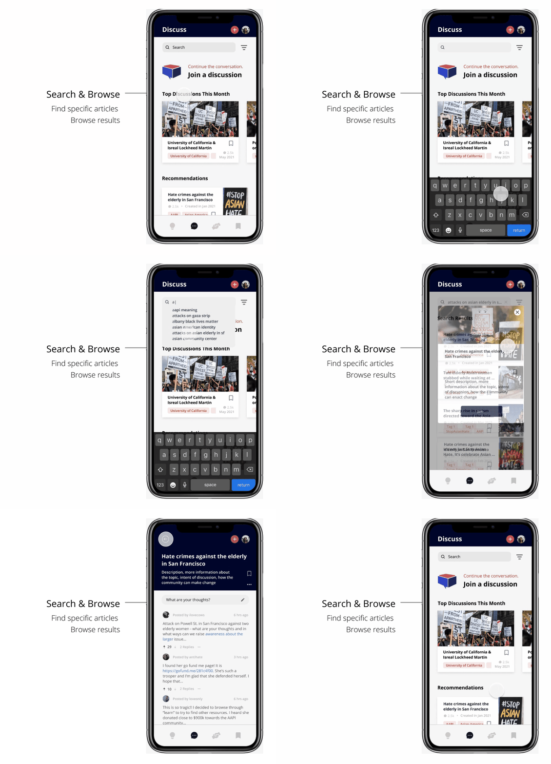
Search & Browse
Search Bar in Discuss that allows users to search for a specific discussion and browse if it is not on their Recommended Discuss feed

Filter the content
Users can also filter and sort their information in combination with different tags or even choose specific locations, which allows them to engage with their community or different communities across the world. For example, if someone from New York wanted to see discussions about San Francisco, they can change their preferences in the filter.
Donate Section
CREATED BY KAI 😔


Customized Feed
On the donation page, users can browse different organizations and filter them to their liking.
Organization Profiles
Selecting an organization’s card opens up a profile that includes a mission statement, link to donate externally, and similar recommended organizations.
Saved Section
CREATED BY 🐵🐹🐰😔

All from one place
The saved page brings together all the bookmarked contents in one convenient page that encourages long-term engagement.
Final thoughts
Challenges 🕺
Designing the app has been a challenging and rewarding journey.
After our first round of research we realized the prompt we were designing around did not align with our users’ needs. Solely relying on monetary support as a solution to hate crimes is the direct manifestation of the same type of “performative activism” both us and our users were concerned about, leading us to take a new direction with our research.
Because of this redirection, we were on a time crunch trying to keep up with the design sprint. Although we had to schedule extra meetings and work some late nights, we were able to keep up and make it work.
We were also overwhelmed during ideation because hate crime prevention is a big problem and solutions we came up with didn’t feel adequate in solving it. We stepped back and reviewed our insights from user research to narrow down ways we could make an impact on a smaller scale, which could merge and make a larger impact.
Takeaways 💃
We learned to let go of ideas that aren’t working and adapt when things don’t go as planned. Ultimately, to focus on users, their goals, and to look beyond at the larger problem at hand.
Next Steps 🏃♂️
Given more time, we would’ve liked to integrate a feature that checks the quality of resources that users upload through reporting or alerting. We want to ensure that Soapbox is a safe and reliable platform for users to learn.
One of our goals is helping users develop long-term commitment to educating themselves and fighting hate crime, not just when it is a popular topic. A potential idea is creating a feedback system for donations, which would allow users to share their donation with others on social media and encourage future donating. Another idea is integrating a daily recommendation system, to encourage users to learn about something new everyday.
Why Soapbox?
You’re probably wondering, what’s a soapbox?
A soapbox is a raised platform on which one stands to make an impromptu speech, often about a political subject.
We named our app ‘Soapbox’ because it gives users a platform to understand people in their community, hear different stories and perspectives from a diverse range of people, and to take action.
meet the amazing humans behind it all :)

The Soapbox Crew :)
It was such a fun six weeks working with Kai, Jessica, Shirley, and Emily! It was a wild ride indeed, but an incredibly rewarding one! I look up to each and every one of them and am blown away by how our interests and strengths complimented each other. Kai's insightful observations helped the team hone in on the app's purpose. Jessica's user-centric process helped us to realize what users really needed. Shirley's perseverance helped the team turn rough concepts into intuitive solutions. Last but not least, Emily's wisdom, encouragement, and guidance gave us the tools to navigate through the design process. I learned so much from everyone and feel incredibly blessed to collaborate with such a wonderful group of people with such diverse skillsets and interests.
Give it up for the Soapbox crew and cheers an amazing quarter! 👏 👏
Thank you for reading! I hope you enjoyed this case study. Here’s to taking a step closer towards raising awareness for the fight against hate crimes!

